Colorado Springs Utilities’ legacy website
Colorado Springs Utilities’ legacy website
01
Problem
suffered from a confusing navigation structure
02
Insight
hindering user’s ability to quickly access essential services and information
03
solution
necessitating a
complete redesign of
the menu system.
01
Problem
Suffered from a confusing navigation structure
Hindering user’s ability to quickly access essential services and information
02
INSIGHT
Suffered from a confusing navigation structure
03
SOLUTION


Jordan went above and beyond to find creative solutions for CSU, especially for their menus. It was a large site with complex set of navigation needs, and he researched alternatives on his own time to come up with an elegant, intuitive solution that delighted the client.
Lead Strategist, Webstacks
Emily Winsauer

Disciplines
Art Direction
Visual Design
UX Design
Disciplines
Art Direction
Visual Design
UX Design
Tools
Figma
Jira
Slickplan
Tools
Figma
Jira
Slickplan
Team
2 Designers
1 Developer
1 Project Manager
1 Strategist
Team
2 Designers
1 Developer
1 Project Manager
1 Strategist
Timeline
March-May 2024
Timeline
March-May 2024
Introduction
Introduction
At the start of 2024, I was part of a five-person team responsible for redesigning the Colorado Springs Utilities (CSU) website.
At the start of 2024, I was part of a five-person team responsible for redesigning the Colorado Springs Utilities (CSU) website.
CSU is a community-owned enterprise providing electric, natural gas, water, and wastewater services to Colorado Springs and surrounding areas. With over 180,000 active monthly users, CSU approached us to redesign their outdated website, which was described as a cumbersome user experience. My role encompassed art direction, visual design, and UX design.
CSU is a community-owned enterprise providing electric, natural gas, water, and wastewater services to Colorado Springs and surrounding areas. With over 180,000 active monthly users, CSU approached us to redesign their outdated website, which was described as a cumbersome user experience. My role encompassed art direction, visual design, and UX design.
The Problem
The Problem
The outdated navigational menu and submenu pages created a frustrating user experience, making it difficult for customers to find critical information about their utilities and services.
CONFIRMATION
I uncovered two clear indicators that confirmed the problem.

Confirmation 01
UX Heuristics

Confirmation 01
UX Heuristics

Confirmation 02
Stakeholder Interviews

Confirmation 02
Stakeholder Interviews

Confirmation 01
UX Heuristics

Confirmation 01
UX Heuristics

Confirmation 01
UX Heuristics
Using Jakob Nielsen's 10 Usability Heuristics, we found that CSU's navigational menu violated two key principles:
Using Jakob Nielsen's 10 Usability Heuristics, we found that CSU's navigational menu violated two key principles:
Breaking Rule #4
Consistency & Standards
Consistency & Standards
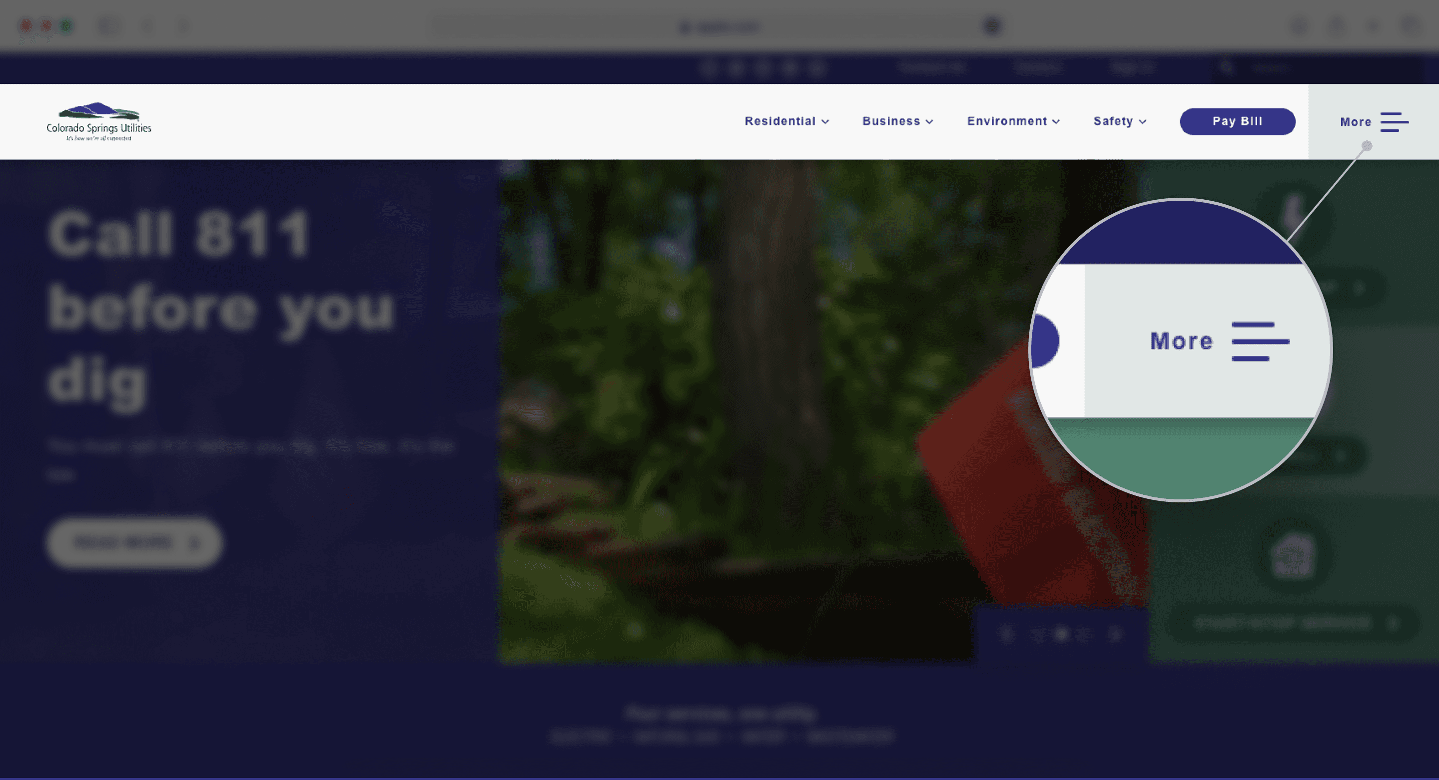
The "more" menu item used a hamburger icon, inconsistent with other menu items that used a traditional chevron. This created confusion about whether there was a sub-menu within a menu or two separate menus.
The "more" menu item used a hamburger icon, inconsistent with other menu items that used a traditional chevron. This created confusion about whether there was a sub-menu within a menu or two separate menus.


Breaking Rule #6
Recognition rather than recall
Recognition rather than recall
The relationship between nav links and menu options was unclear, forcing users to memorize link locations. For instance, "services" and "education" were under a generic "more" tab, resulting in a confusing information architecture.
The relationship between nav links and menu options was unclear, forcing users to memorize link locations. For instance, "services" and "education" were under a generic "more" tab, resulting in a confusing information architecture.


CONFIRMATION
I uncovered two clear indicators that confirmed the problem.

Confirmation 02
Stakeholder Interviews

Confirmation 02
Stakeholder Interviews

Confirmation 02
Stakeholder Interviews
Our strategist conducted stakeholder interviews, which unanimously called for a mega menu implementation. Key quotes include:
Our strategist conducted stakeholder interviews, which unanimously called for a mega menu implementation. Key quotes include:
“Our navigation is such a mess... mega menu makes a ton of sense for us."
- Public Affairs Specialist


“I am hopeful the site will have a new structure, new mega menu , breadcrumbs...”
- IT Project Manager
Research
Research
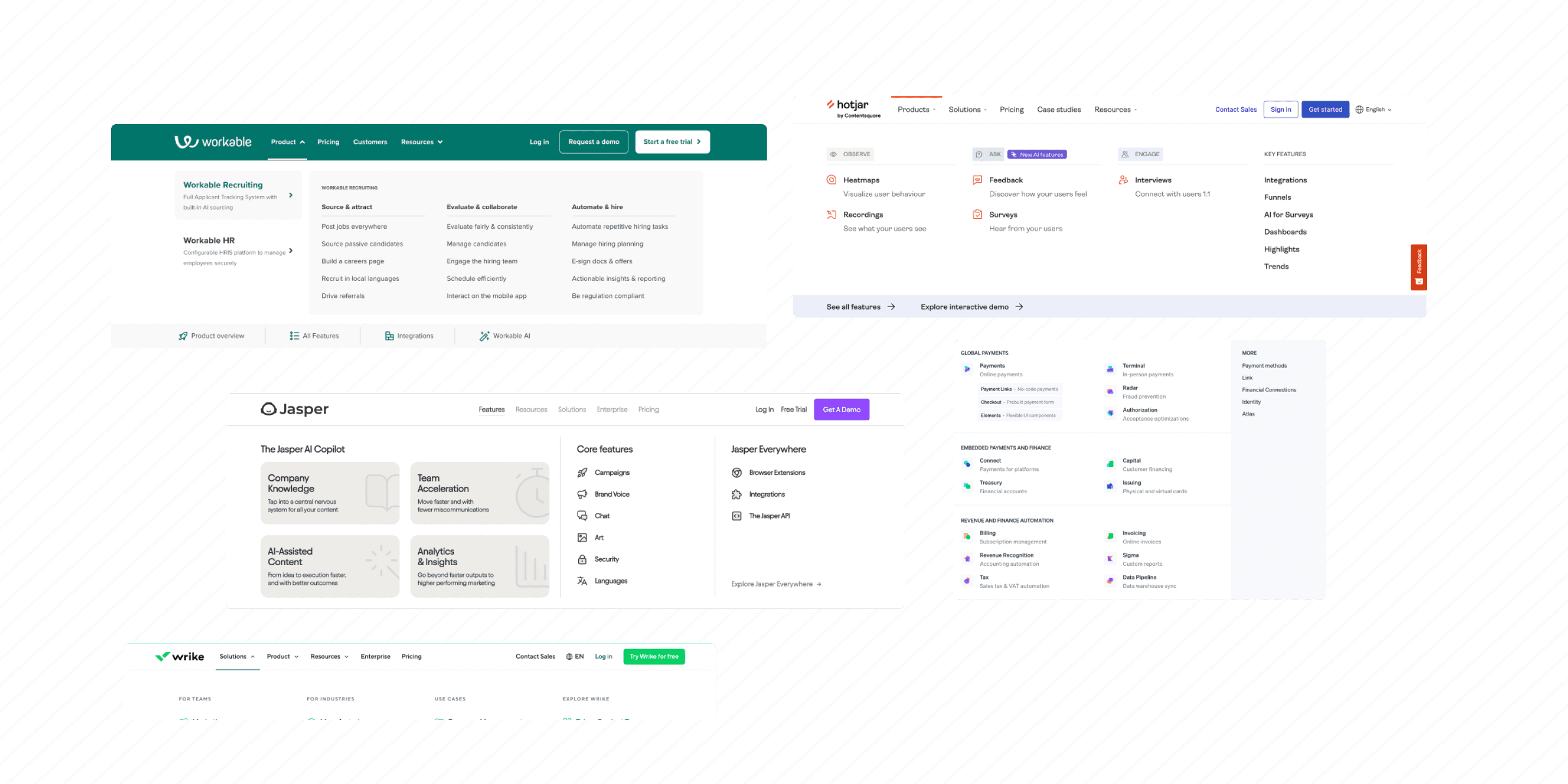
I did an audit of over 20+ enterprise level mega menus.
I did an audit of over 20+ enterprise level mega menus.
Particularly I detailed everything from column layouts, multi-level UX patterns, marketing panels, and information distribution methods
Particularly I detailed everything from column layouts, multi-level UX patterns, marketing panels, and information distribution methods


best in class examples
Enterprise mega menus
persona
persona
Based on stakeholder interviews, we identified the following user types and their main actions on the website:
Based on stakeholder interviews, we identified the following user types and their main actions on the website:
Type Of User:
Type Of User:
residential customers
commerical customers
community organization
community or special interest groups
Residential customers
Commercial customers
Community organization
Community or special interest groups
Main Actions On Website:
Main Actions On Website:
how to view, pay bill
how to request payment assist
start/stop/transfer bill
view usage
see outage map when it’s urgent
How to view, pay bill
How to request payment assist
Start/stop/transfer bill
View usage
See outage map when it’s urgent

Challenge
Our primary challenge was to fit over 200 pages into an intuitive navigational system that worked seamlessly on both desktop and mobile platforms.

Challenge
Our primary challenge was to fit over 200 pages into an intuitive navigational system that worked seamlessly on both desktop and mobile platforms.

Challenge
Our primary challenge was to fit over 200 pages into an intuitive navigational system that worked seamlessly on both desktop and mobile platforms.
We developed three key solutions to address the navigation problems:
We developed three key solutions to address the navigation problems:

Solution 01
Restructuring all pages into three levels.

Solution 01
Restructuring all pages into three levels.

Solution 02
Multiple opportunities for quick actions.

Solution 02
Multiple opportunities for quick actions.

Solution 03
A separate user-flow on mobile.

Solution 03
A separate user-flow on mobile.

Solution 01
Restructuring all pages into three levels.

Solution 01
Restructuring all pages into three levels.

Solution 01
Restructuring all pages into three levels.
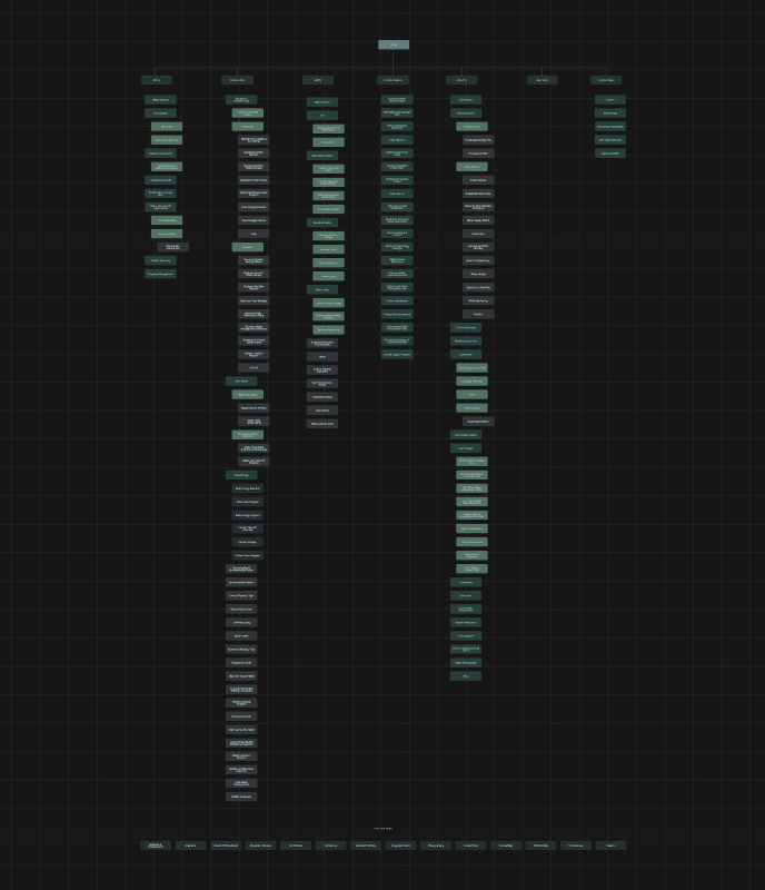
I collaborated closely with our strategist on building out a navigational system. We used slick plan to outline the new navigation structure. Below is the updated site map outlined and drafts of the mega menu hierarchy.
I collaborated closely with our strategist on building out a navigational system. We used slick plan to outline the new navigation structure. Below is the updated site map outlined and drafts of the mega menu hierarchy.


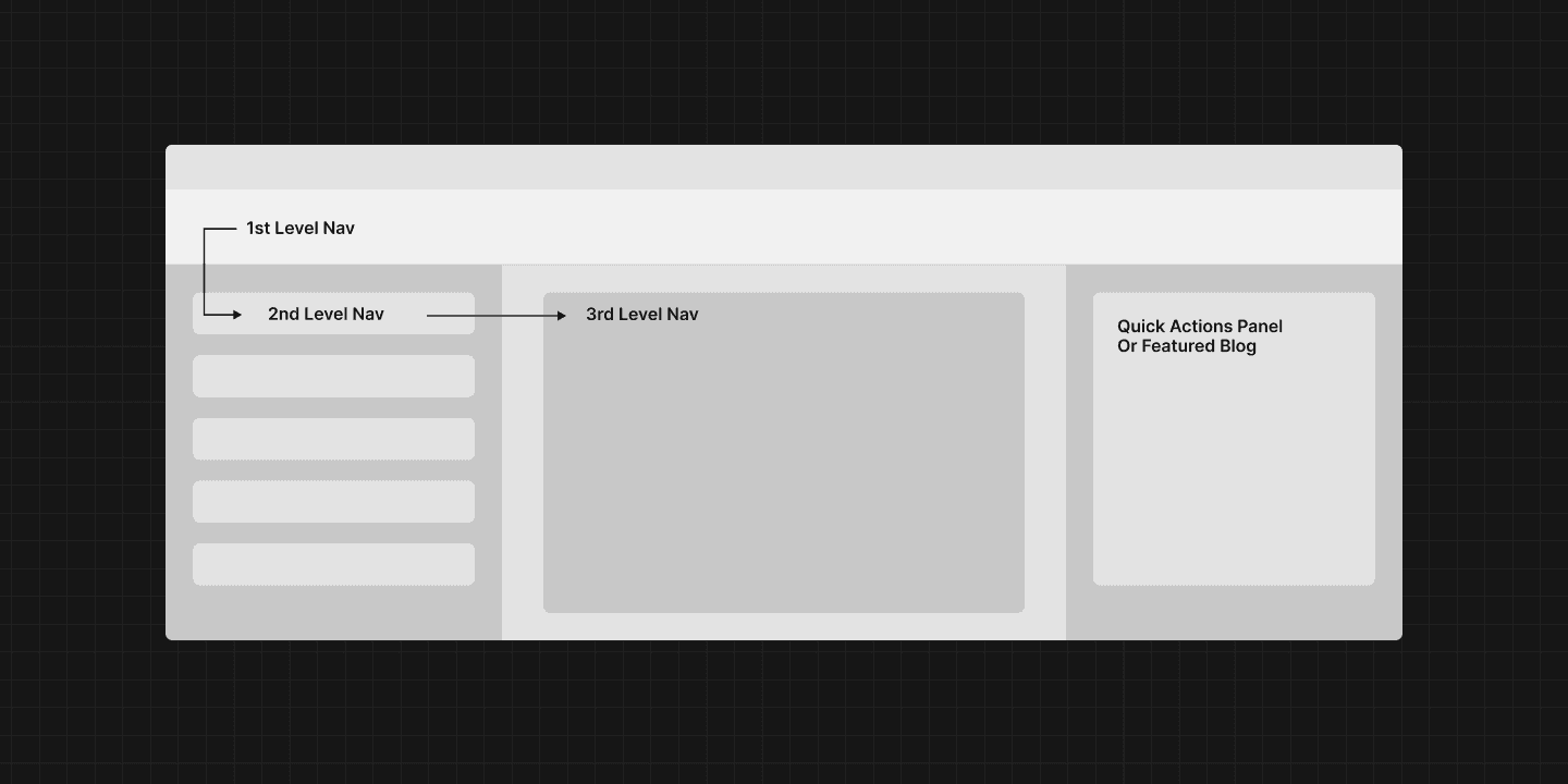
I used low-fidelity wireframes to establish user flow logic for the three levels.
I used low-fidelity wireframes to establish user flow logic for the three levels.


To help the navigation feel less intimidating I used typography and color to help direct the user on the hierarchy of information.
To help the navigation feel less intimidating I used typography and color to help direct the user on the hierarchy of information.
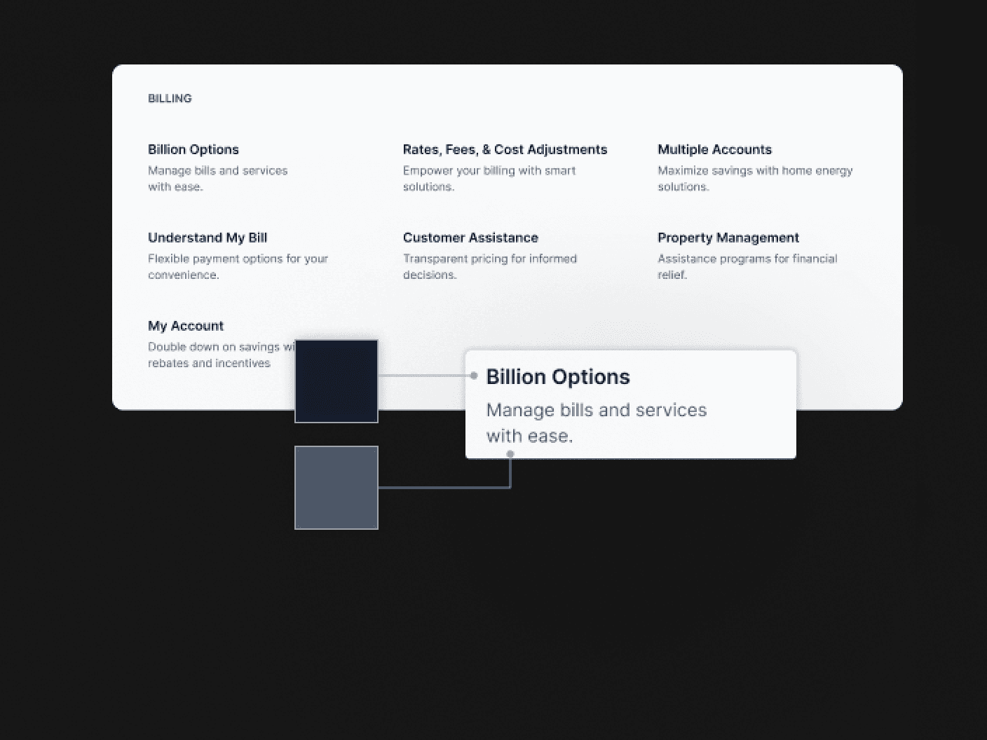
Used color shading to help with readability.

Used color shading to help with readability.

Used color shading to help with readability.
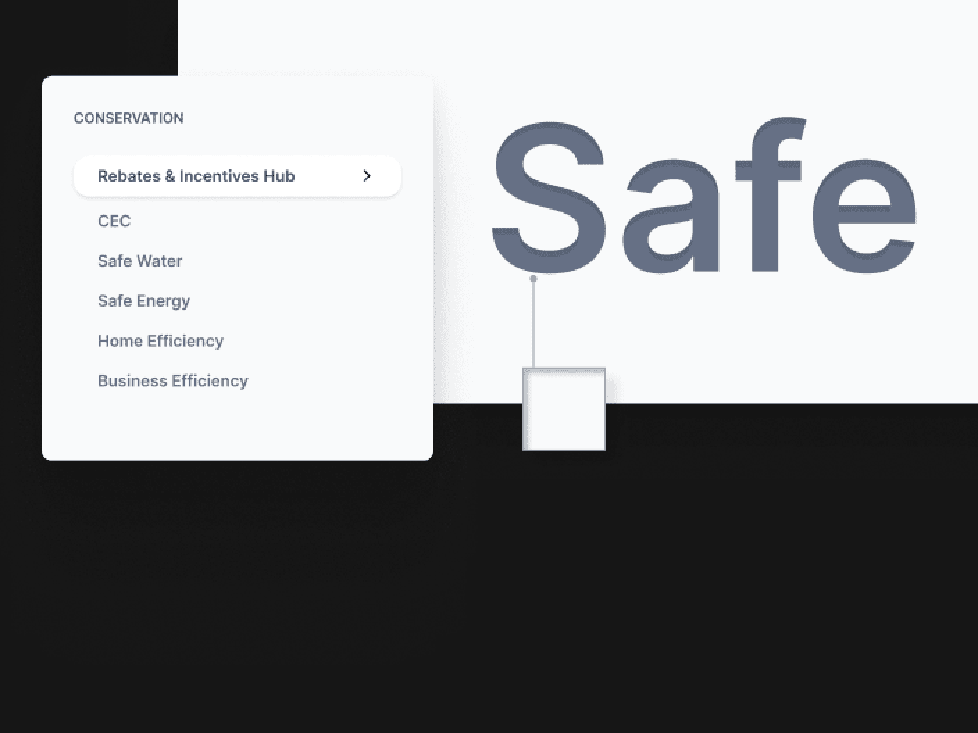
Used inner shadow to help “sharpen” the text in menu.

Used inner shadow to help “sharpen” the text in menu.

Used inner shadow to help “sharpen” the text in menu.
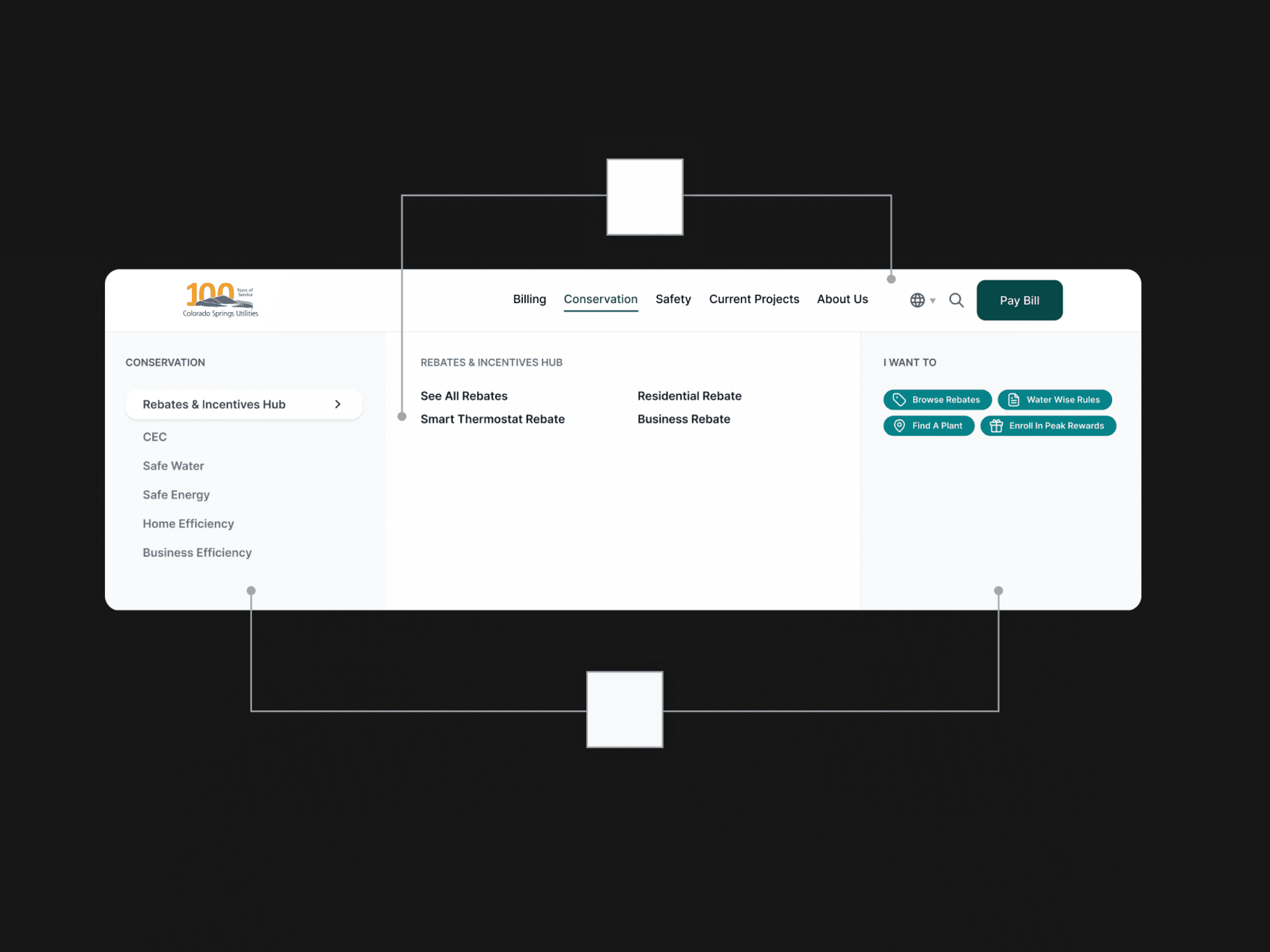
Used color shading to differentiation the panels.

Used color shading to differentiation the panels.

Used color shading to differentiation the panels.

Solution 02
Creating multiple opportunities for quick actions in each level

Solution 02
Creating multiple opportunities for quick actions in each level

Solution 02
Creating multiple opportunities for quick actions in each level
Three levels of navigation on a website is inherently intimidating. We wanted to make sure no matter how deep a user was in the navigation process, there were multiple opportunities for a quick action. Even though the mega menu was designed to be as easy to use as possible, we wanted to avoid forcing the user to go through each level.
Three levels of navigation on a website is inherently intimidating. We wanted to make sure no matter how deep a user was in the navigation process, there were multiple opportunities for a quick action. Even though the mega menu was designed to be as easy to use as possible, we wanted to avoid forcing the user to go through each level.
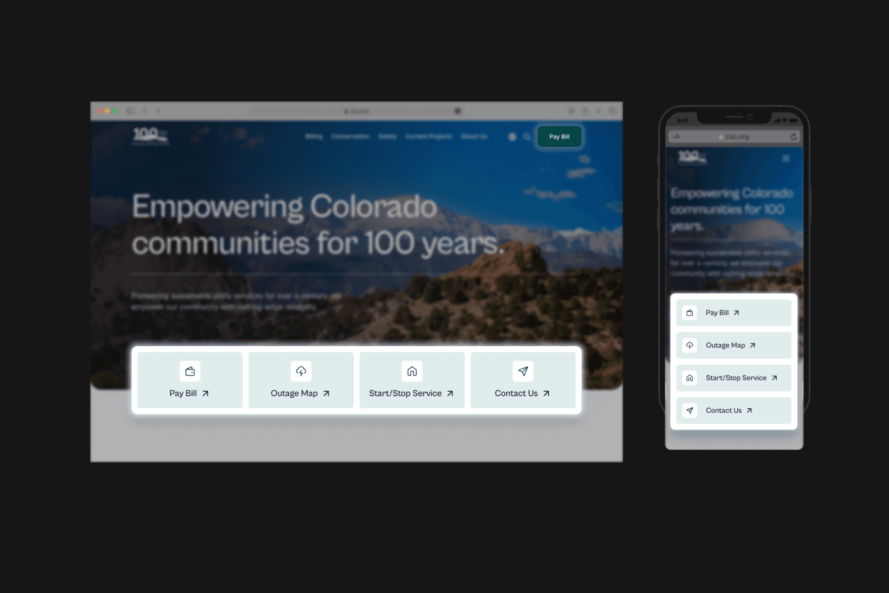
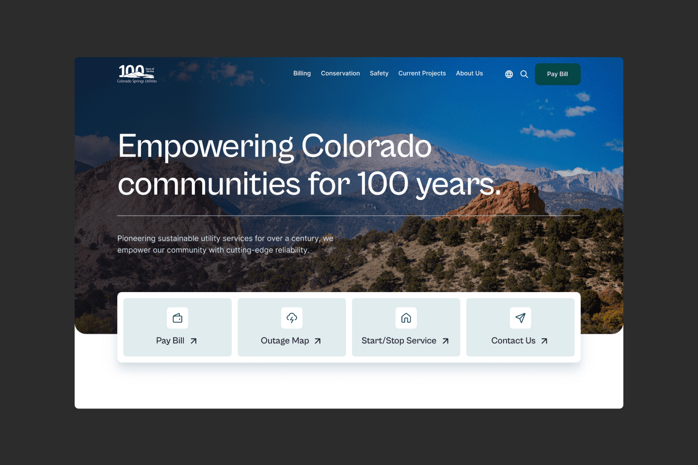
The homepage features a prominent quick action card deck, designed to be large and simple. This allows users to access their most common tasks immediately, without needing to interact with the main navigation. While we designed the mega menu to be as user-friendly as possible, we wanted to avoid forcing users to navigate through multiple levels to complete frequent actions.
The homepage features a prominent quick action card deck, designed to be large and simple. This allows users to access their most common tasks immediately, without needing to interact with the main navigation. While we designed the mega menu to be as user-friendly as possible, we wanted to avoid forcing users to navigate through multiple levels to complete frequent actions.


If the user does need to interact with the mega menu, we provide a quick actions panel on the left.
If the user does need to interact with the mega menu, we provide a quick actions panel on the left.
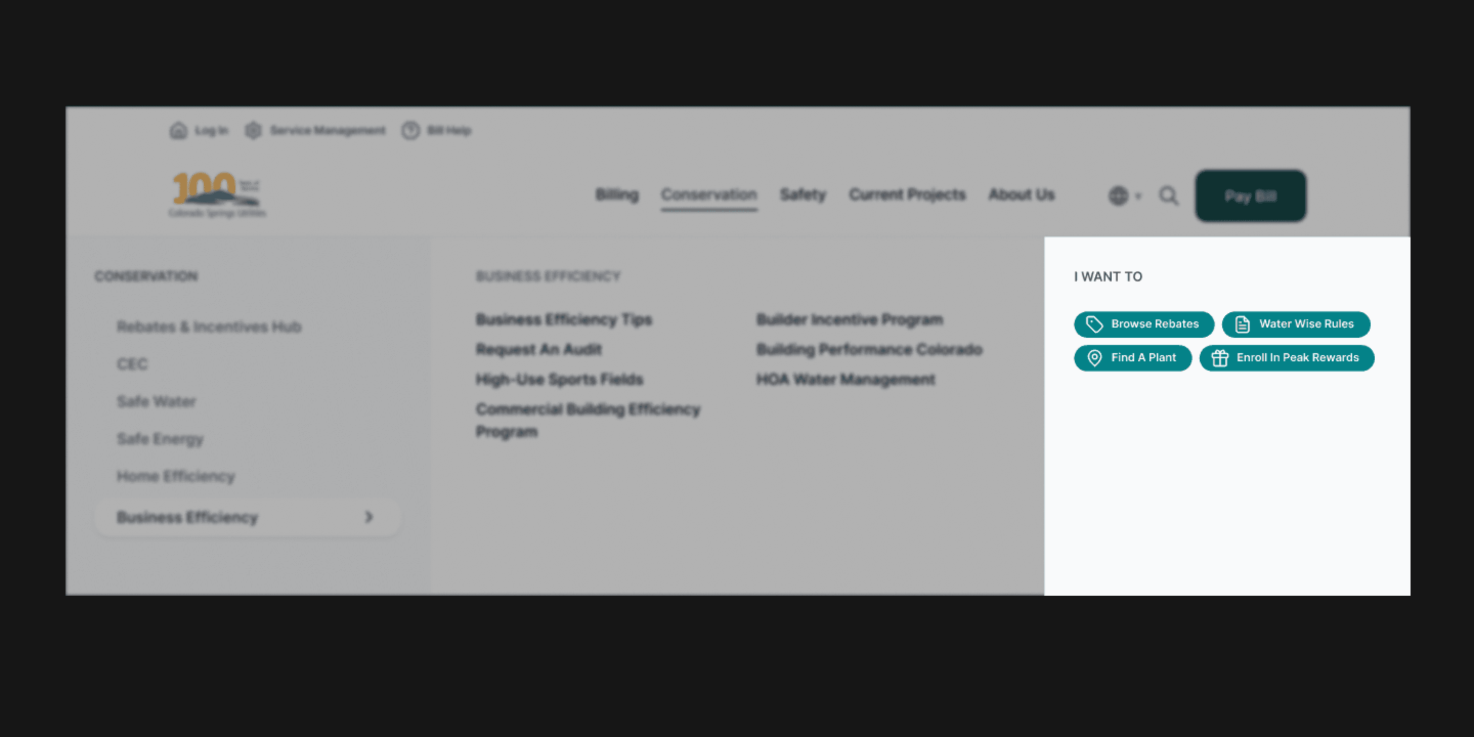


Based off our stakeholder interviews, we determined the main actions of users and broke them down by category. Each action panel has different badges that is correlated with the navigational tab they are on (billing has it’s own set vs conservation).
Based off our stakeholder interviews, we determined the main actions of users and broke them down by category. Each action panel has different badges that is correlated with the navigational tab they are on (billing has it’s own set vs conservation).


Solution 03
Creating a separate user-flow on mobile

Solution 03
Creating a separate user-flow on mobile

Solution 03
Creating a separate user-flow on mobile
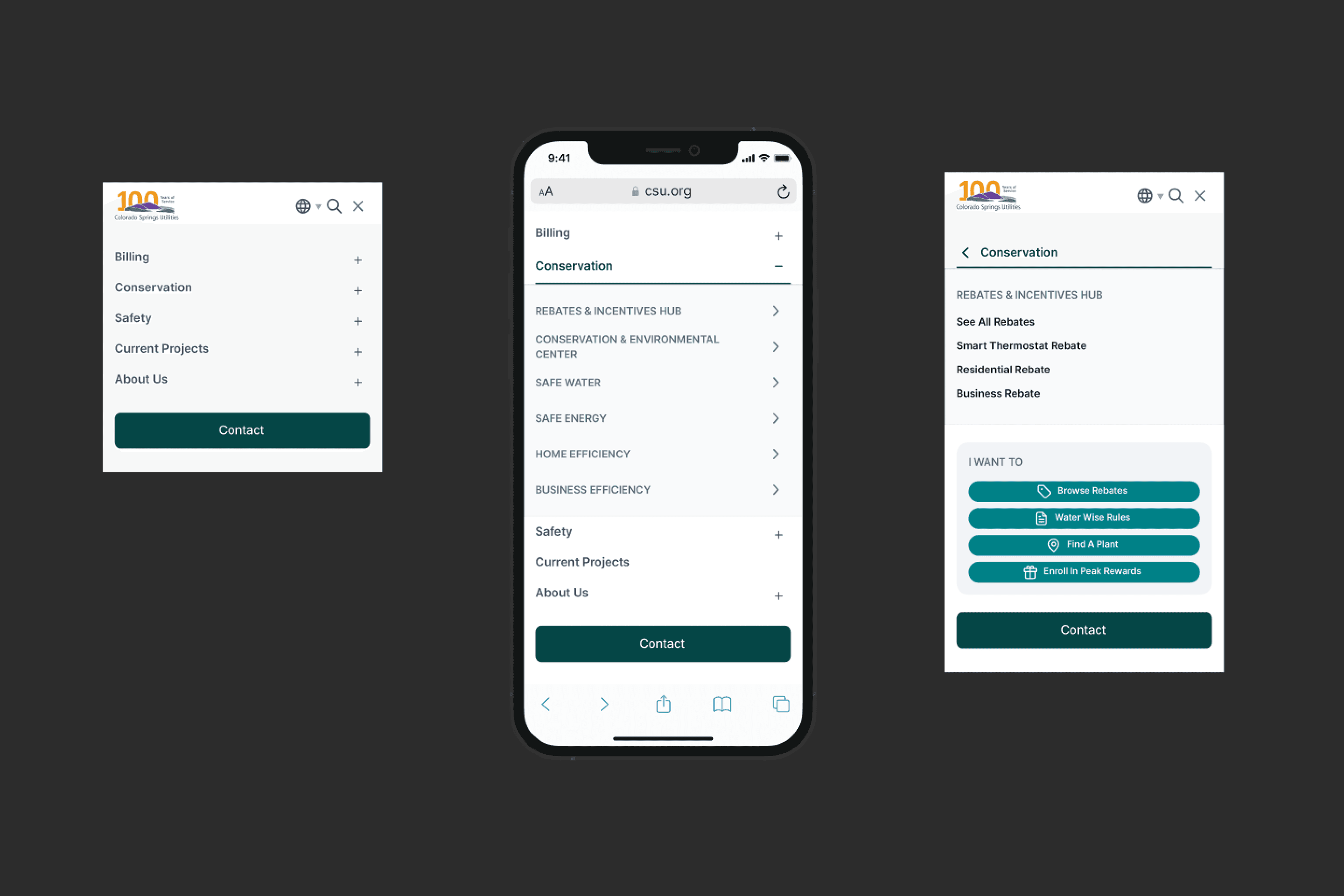
My first attempt was building an accordion-style mobile navigation. I quickly realized that this was going to be an issue with how long it got. I decided to create a completely separate user flow for mobile where it was was broken down into a three step process.
My first attempt was building an accordion-style mobile navigation. I quickly realized that this was going to be an issue with how long it got. I decided to create a completely separate user flow for mobile where it was was broken down into a three step process.
design system compliance
design system compliance
The entire menu system was built in accordance with the design system we created for CSU, ensuring consistency across the platform.
The entire menu system was built in accordance with the design system we created for CSU, ensuring consistency across the platform.
final design
final design




Reflection
Reflection
So grateful that I got to be apart of this project and I learned so much! Some lessons I learned include:
Overcame the challenge of limited user data by leveraging stakeholder insights, conducting thorough audits of best practices, and prioritizing UX heuristics in design decisions.
Recognized the importance of not only constructing solutions but also anticipating potential problems.
Emphasized the value of forward-thinking in design processes.

About me
For too long, design has been in a chokehold from the worldview that its sole purpose is to solve problems. Consequently, we produce things that are boring and insufferable. Of course, we solve problems to the best of our ability—the bare minimum. Why do we stop there? What happened to child-like play or curiosity? Are we too mature for beauty only for beauty's sake? How did we become so obsessed with consistency? I've dedicated my life to this spirit of rebellion and the craft of delightful moments.