Disciplines
Package Design
Branding
Strategy
Tools
Illustrator
InDesign
Aren.na
Team
1 Designers
2 Founders
Timeline
Jan-Jun 2022
Mirror Coffee was launching a new product
01
Problem
But they lacked a focused brand identity
02
Insight
which made the packaging design difficult
03
solution
necessitating owner’s buy-in to reshape their brand
01
Problem
But they lacked a focused brand identity
Which made the packaging design difficult
02
INSIGHT
necessitating owner’s buy-in to reshape their brand
03
SOLUTION


Jordan blew our expectations out of the water. He took the time to understand what we were looking for and then came back with a few incredible, thought through concepts. We’ll definitely be coming back to him for future projects!

Co-Founder, Mirror Coffee
Mark Kutrovski


Jordan blew our expectations out of the water. He took the time to understand what we were looking for and then came back with a few incredible, thought through concepts. We’ll definitely be coming back to him for future projects!

Co-Founder, Mirror Coffee
Mark Kutrovski
Disciplines
Package Design
Branding
Strategy
Tools
Illustrator
InDesign
Aren.na
Team
1 Designers
2 Founders
Timeline
Jan-Jun 2022
Introduction
Introduction
Mirror coffee is a start-up coffee roaster and was having difficulty finding it’s unique identity.
Mirror coffee is a start-up coffee roaster and was having difficulty finding it’s unique identity.
On top of that, they were launching a new product and wanted the packaging for it to be a statement. I was originally assigned to just do packaging design only to quickly realize they desperately needed branding guidance. The founders we’re wanting the packaging to be unique to who they were. Their goal was the box when seen by the public, to be recognized as a “mirror” box.
On top of that, they were launching a new product and wanted the packaging for it to be a statement. I was originally assigned to just do packaging design only to quickly realize they desperately needed branding guidance. The founders we’re wanting the packaging to be unique to who they were. Their goal was the box when seen by the public, to be recognized as a “mirror” box.
The Problem
The Problem
The problem was they weren’t able to communicate who they we’re serving the product for, what makes their voice unique, or any general art direction.
Brand Discovery
Brand Discovery
Did a series of interviews with the owners trying to hone in on what their core identity was. Questions I asked were about their history, the problems they were trying to solve, and the vision of their shop.
Did a series of interviews with the owners trying to hone in on what their core identity was. Questions I asked were about their history, the problems they were trying to solve, and the vision of their shop.
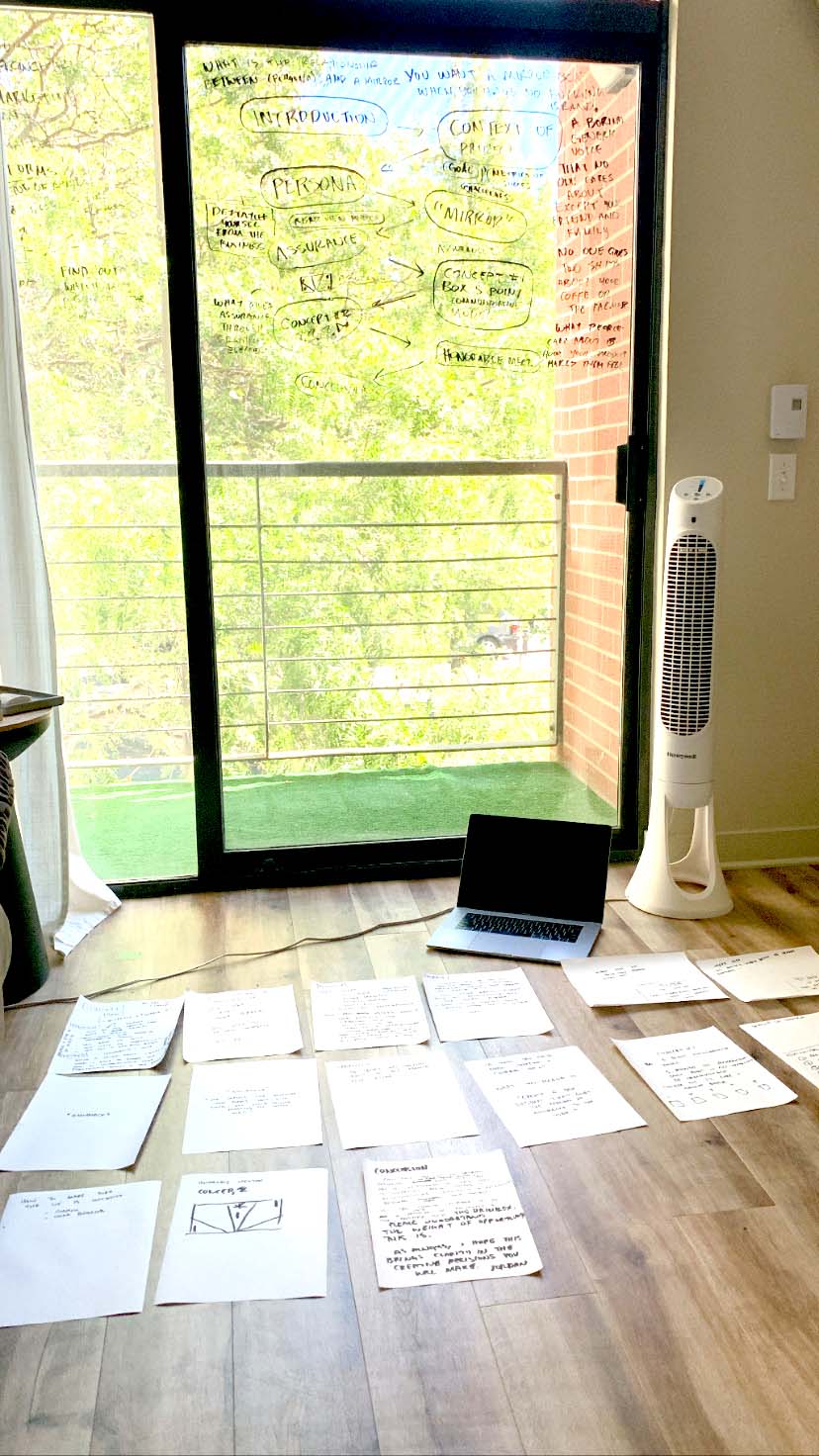
My note-taking process usually involves mind mapping. I've found that it's a good way to uncover relationships of scattered data or information. This is just a snapshot of an extensive amount of note-taking through the stakeholder interviews.
My note-taking process usually involves mind mapping. I've found that it's a good way to uncover relationships of scattered data or information. This is just a snapshot of an extensive amount of note-taking through the stakeholder interviews.
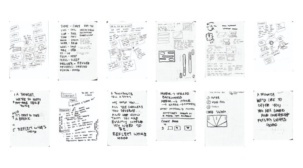

Uncovering brand problem
Uncovering brand problem
I uncovered that originally the term "Mirror" in their name was supposed to refer to the mirror inside DSLR cameras, because of the owner's original passion for photography. I found this to be a problem because they weren't communicating that clearly through their art direction. Additionally, trying to blend two mediums—coffee and cameras wasn't really the focus. What the owners really wanted was to communicate that they wanted to reflect the feeling of empathy and support to their community.
I uncovered that originally the term "Mirror" in their name was supposed to refer to the mirror inside DSLR cameras, because of the owner's original passion for photography. I found this to be a problem because they weren't communicating that clearly through their art direction. Additionally, trying to blend two mediums—coffee and cameras wasn't really the focus. What the owners really wanted was to communicate that they wanted to reflect the feeling of empathy and support to their community.
convincing owners of brand change
convincing owners of brand change
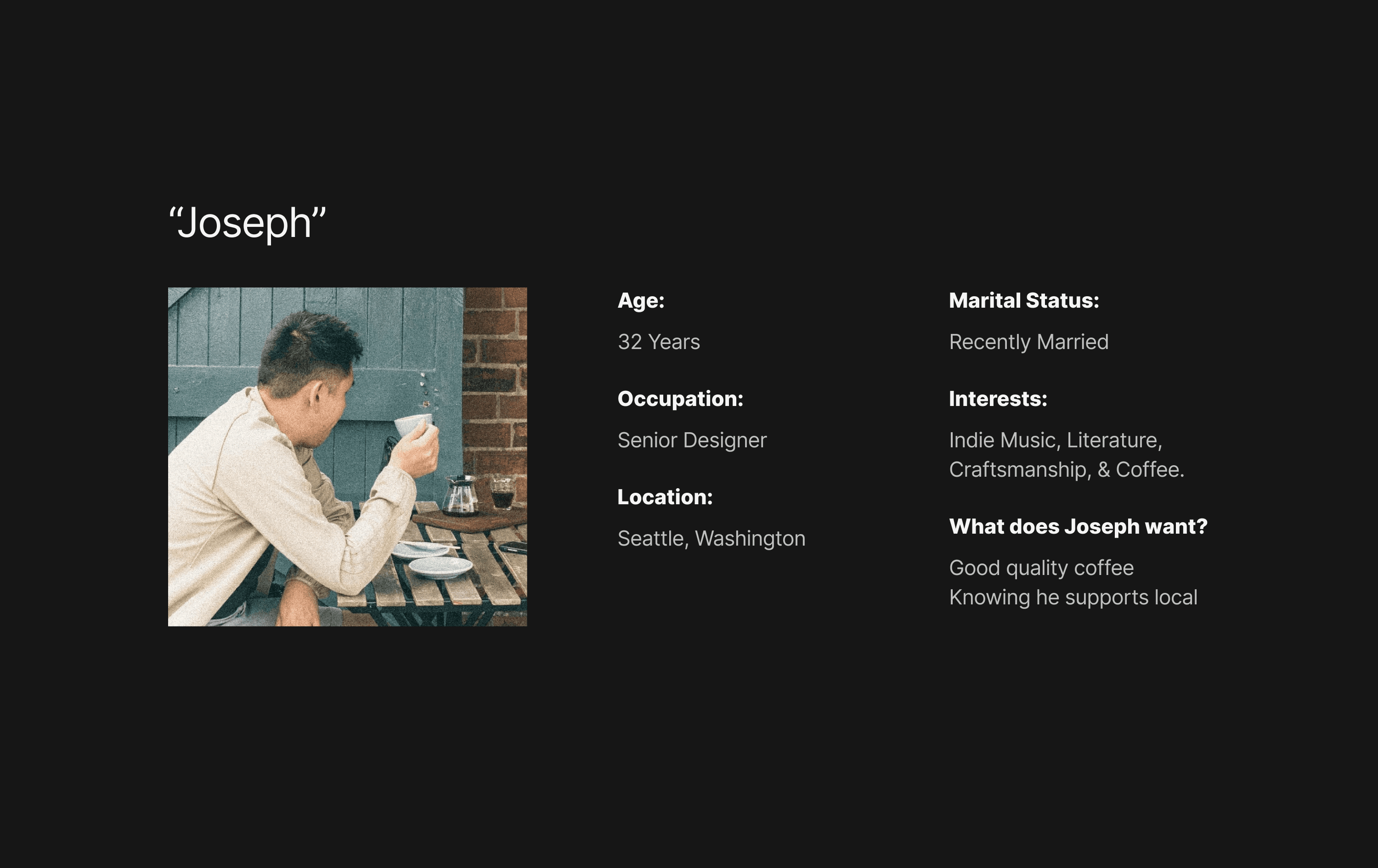
I had the task of not only asking the owners to let go of the photography angle, but also nudging them to focus on clearer messaging. My angle was to help them understand their customer through a persona, I named it Joseph.
Next I had to nudge them to no longer identify themselves in the business. Meaning, that Mirror Coffee should have its own personality—a third person metaphorically. Their issue was that they were tying the brand with their personalities and it was causing dilution in their messaging.
From their I tired to craft a story of Joseph and their relationship to a mirror. The primary reason for interacting with a mirror was for assurance. I then ask them to focus on that feeling moving forward—their brand compass.
5-Point communicative box model
5-Point communicative box model
I was inspired by how the owner explained the shop's crucial role in the coffee-drinking experience. He mentioned how the interior design, the colors, the barista, and the people were all touch points that added to the ultimate act of drinking the coffee.
I asked myself what were the touch points in the act of unboxing?
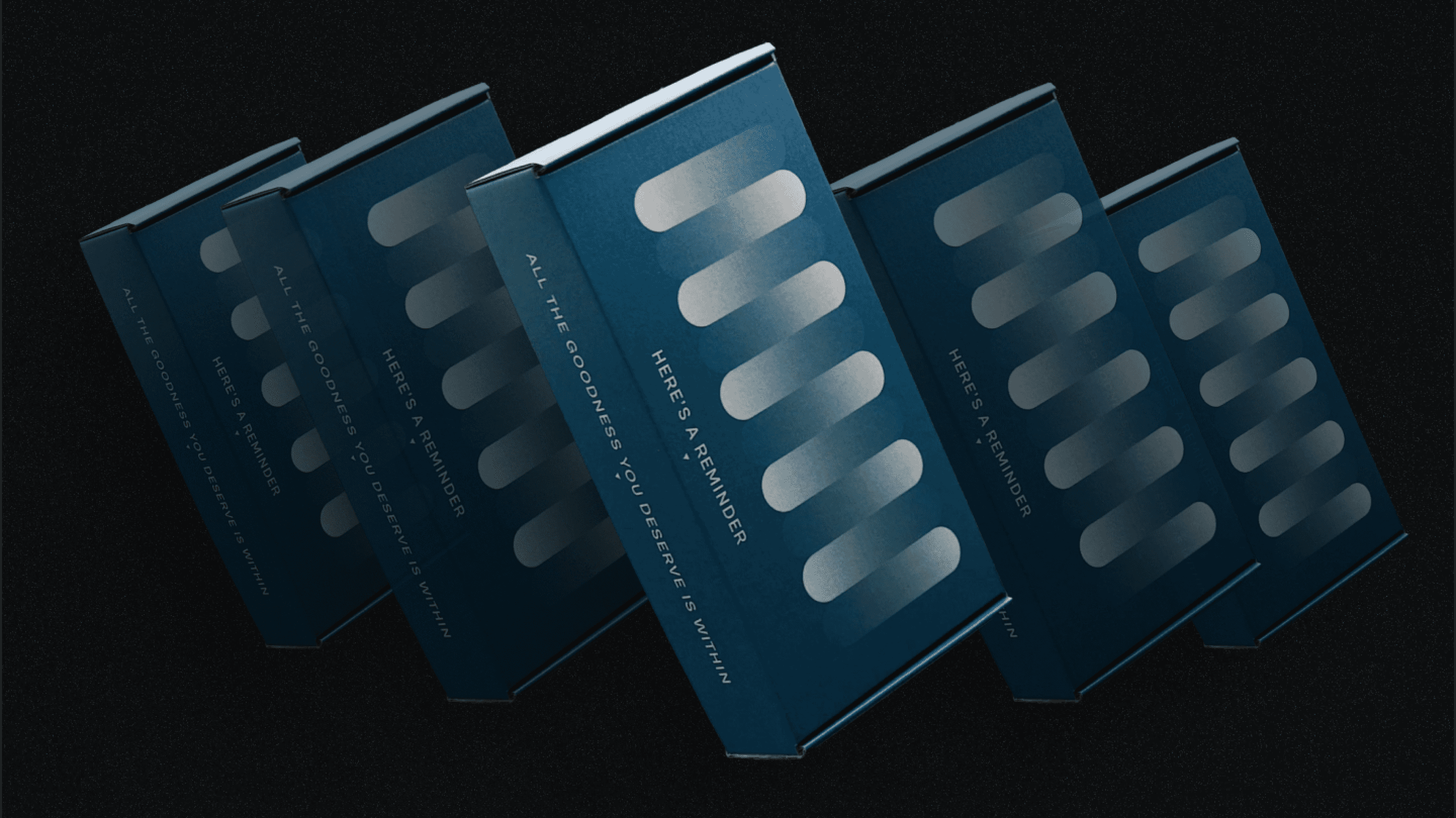
I broke up 5 points of possible interaction with the user opening the shipping box. The 5 points could be imagined like a comic book or story board sequence. The sequence can be used to tell a story or tell a message.
5-point message structure
5-point message structure
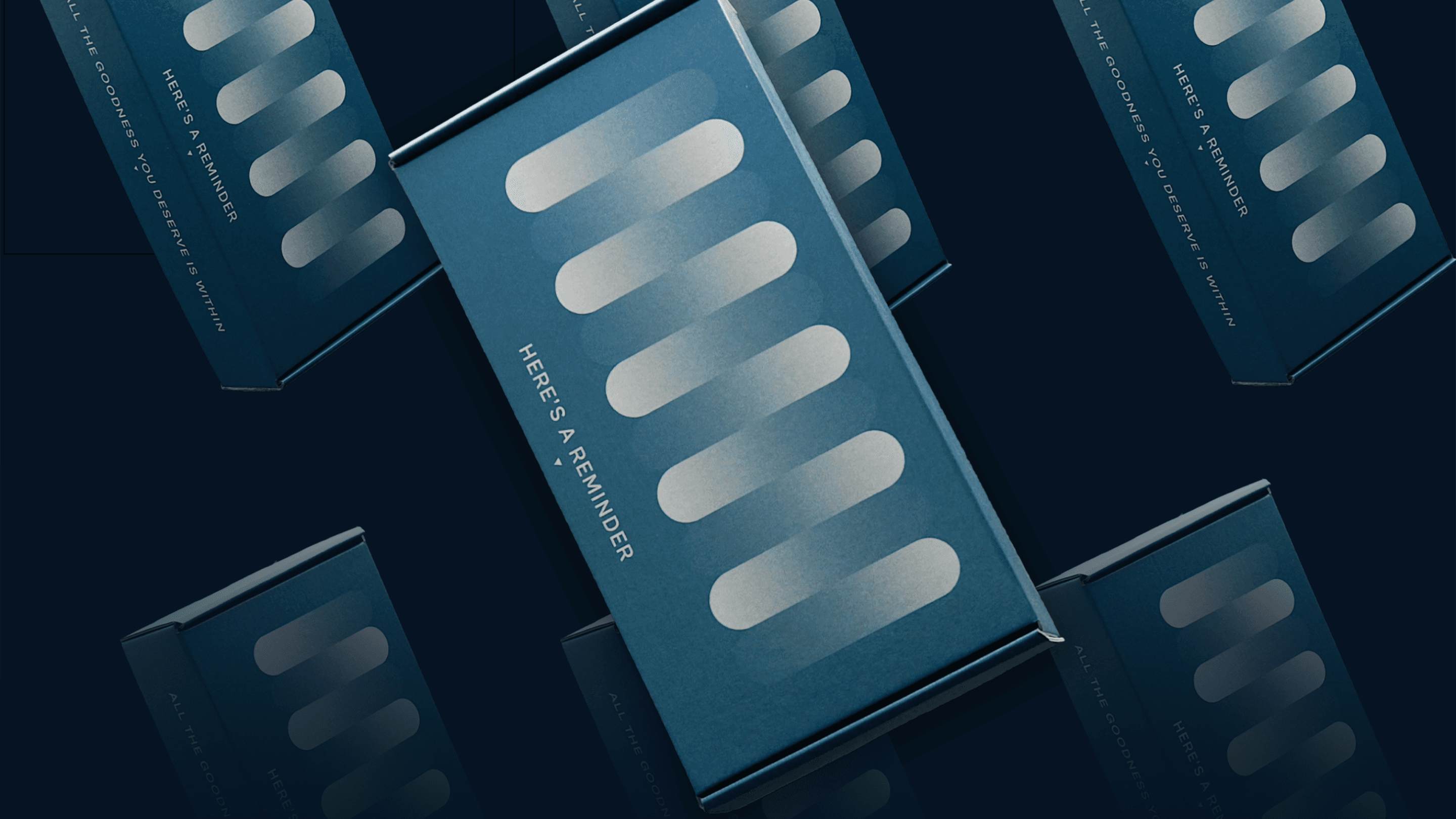
The route I chose was telling an assuring message with points 1-3. Point 4 is the product, and finally, point 5 would be the mission statement. The hope is to create a relationship between the assuring message, the product, and the mission statement.
The route I chose was telling an assuring message with points 1-3. Point 4 is the product, and finally, point 5 would be the mission statement. The hope is to create a relationship between the assuring message, the product, and the mission statement.


Results
Results



About me
For too long, design has been in a chokehold from the worldview that its sole purpose is to solve problems. Consequently, we produce things that are boring and insufferable. Of course, we solve problems to the best of our ability—the bare minimum. Why do we stop there? What happened to child-like play or curiosity? Are we too mature for beauty only for beauty's sake? How did we become so obsessed with consistency? I've dedicated my life to this spirit of rebellion and the craft of delightful moments.